Rebranding Dynaplus
A coherence-led rebrand for Hoenderdaal’s Dynaplus: photography-first storytelling, 3D brand assets, and packaging that puts clarity and trust upfront.Branding · 3D Modeling · Packaging DesignBackground
Dynaplus is part of my ongoing work with Hoenderdaal Fasteners Through 2025 that collaboration accelerated around one goal: a more coherent visual identity across print, packaging, and digital touchpoints. The brand already had strong ingredients; the work was about prioritising what leads and cutting noise that worked against the message.

Problem Statement
Design question: How can we make Dynaplus feel consistent and premium end to end, through simplification of the brand and repurposing of existing assets?
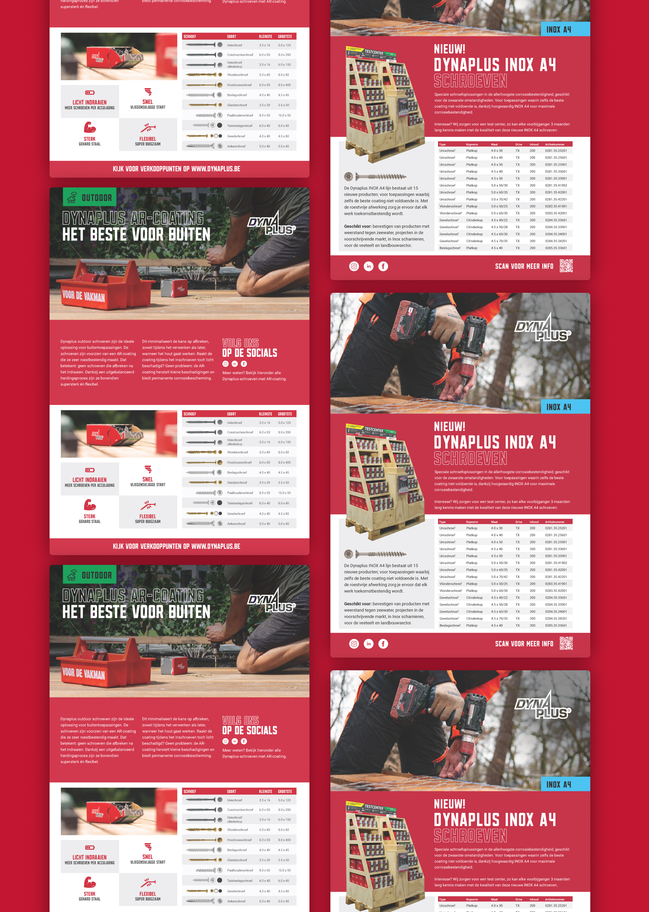
Existing material featured design decisions that made it hard to keep things consistent, which forced Dynaplus to use awkward layouts that forced copy and imagery into positions it might not fit. At the same time, a large library of brand and lifestyle photography was barely deployed. The rebrand needed to put photography and clarity first, then reinforce the story with 3D, iconography, and packaging that all point in the same direction.
 Reviewing old media showed us that inconsistency was a significant issue, while graphical details distracted from content.
Research & Development
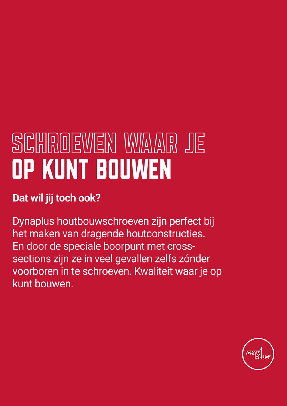
We shifted the focus from cluttered visual elements combined with product shots to a clean brand identity featuring people and proof: showing that customers use and trust the brand. This steered the direction into a more basic design that puts emphasis on content instead of visual clutter.
The full-colour logo was swapped out for a black and white variant to make it more versatile, while 3D brand elements add a premium feel and enhance some simpler brand visuals. These 3D elements are not just used as background products, but also function as end-user guides. A series of icons was developed based on old, more cluttered designs. These focus on being easier to read at a small scale, with some being revised altogether to properly reflect their usecase.
 A commitment to a single logo variant, combined with products being used and 3D elements. More minimalist, more emphasis on the story.
 Application of products can be shown in handy guides through a 3D visual, strengthening a premium look.
Results
Packaging and labels now prioritise user-relevant information in a tighter, calmer structure: easier scanning on shelf, clearer cues about product benefits, and less visual friction between layers of information. Trade and partner-facing print drops decorative clutter in favour of focused messaging, supported by the new 3D components, photography, and iconography instead of ornamental graphics.
This stretch of work does not “finish” a brand, but it grounds Dynaplus in repeatable rules: consistency today makes it easier to extend the identity in future collaboration without re-opening the same problems.