Evolving the BRION Esports branding
A sponsor-independent identity refresh: mascot-led mark, bold colour, and social-first applications for a League team entering a new era.BrandingBackground
BRION Esports spent much of its history competing under title sponsors in the team name. After the organisation ended its partnership with Fredit, the roster returned to the BRION name for the first time since June 2020. I had followed the team since its inception, so I took the moment as a chance to rethink the brand and help them step into a clearer, more independent chapter.
Problem Statement
Design question: How should BRION show up visually now that the name is no longer anchored by a sponsor, while still feeling familiar to longtime fans and practical for broadcast, social, and live events?
Years of co-branded naming meant equity sat in a mix of legacy shapes and partner colours. The organisation needed a single, confident story fans could rally behind: bold enough for esports culture, flexible enough for motion, merch, and day-to-day content, and distinct from the generic “logo + sponsor block” look common in the scene.
Research & Development
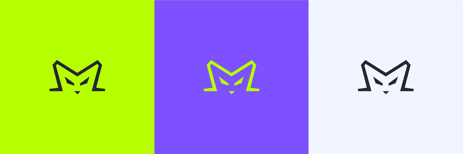
I treated the existing BRION mark as the starting point rather than a blank slate. The refreshed identity keeps the silhouette of the original logo but simplifies it into a minimalist mascot: a character the team can animate, use as a live-event presence, and stretch across layouts without relying on sponsor lockups.
![]() The proces behind the final logo: Simplifying the logo and embracing the mascot concept.
The proces behind the final logo: Simplifying the logo and embracing the mascot concept.
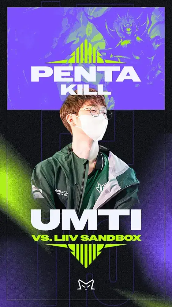
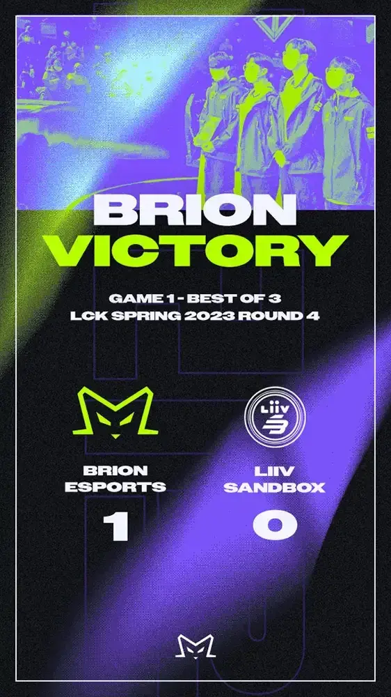
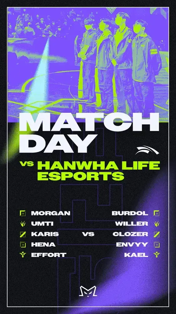
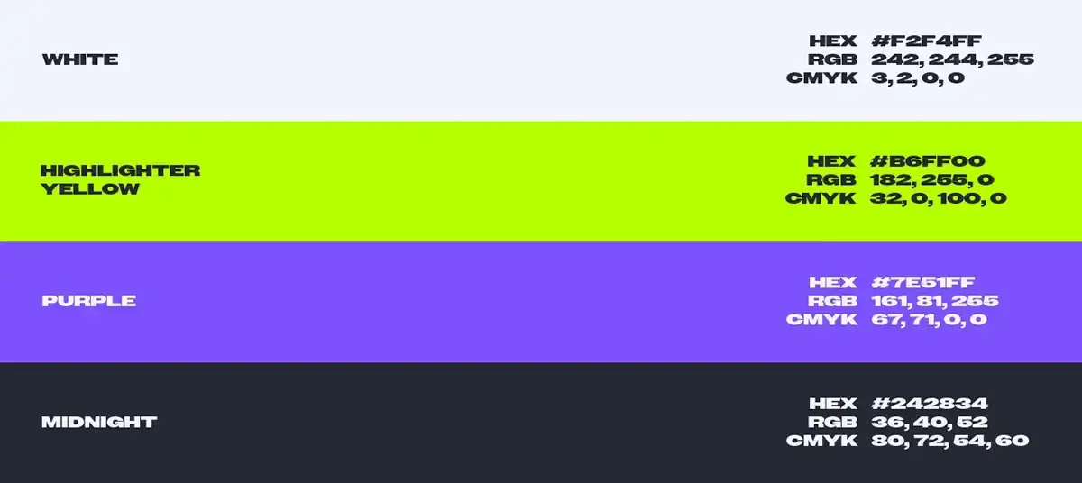
Colour strategy builds on what fans already associated with the team. The highlighter yellow that had lived as a secondary accent became the primary colour to match the “BE BOLD” positioning. I paired it with a second, equally loud hue so palettes stay energetic but structured across media.
Typography follows the same line: heavier, contemporary type that reads as modern and assertive on stream overlays, posters, and thumbnails.

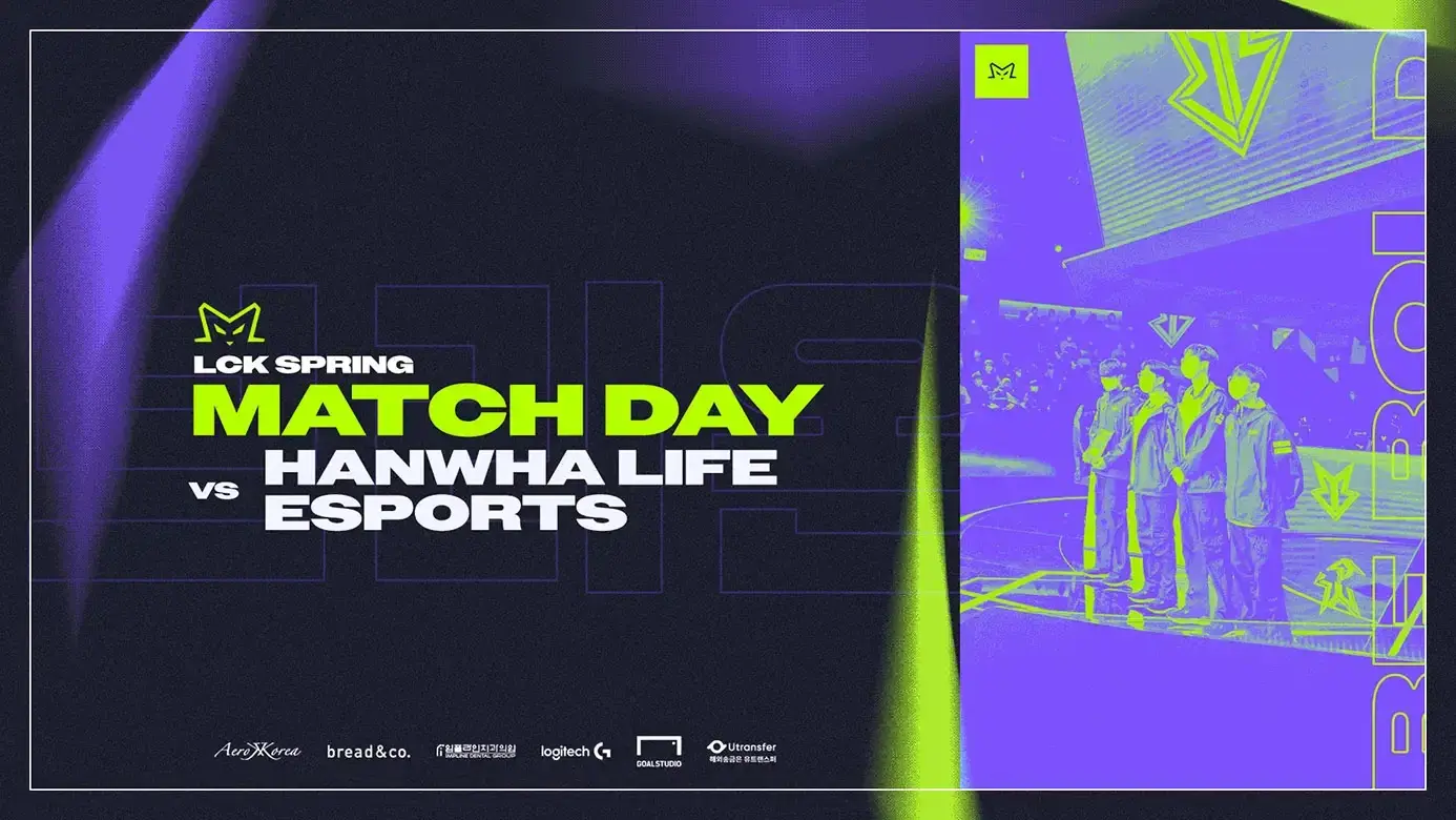
For touchpoints, I prioritised social and broadcast-adjacent surfaces, where esports audiences actually spend time. Treatments use a bitmap and noise layer over colour fields to add grit and energy so posts feel less like flat corporate templates.
Results
The outcome is a coherent identity kit: mascot-led logo explorations, a two-tier colour system built around bold yellow, a stronger typographic voice, and applied templates tuned for social feeds (desktop and mobile formats). The bitmap treatment in particular gives campaign art a more daring, editorial feel while staying on-brand.
Together, the system gives BRION a standalone visual language that does not depend on a title partner in the name, and that can scale as the team's roster and campaigns evolve.